End-to-End UI/UX Design:
Designing for Culture and Emerging Markets
End-to-End UI/UX Design:
Designing for Culture and Emerging Markets
Project Summary
Project Summary
Most museum websites feel outdated, and contemporary art museums in Kenya are almost invisible online. There is little emphasis on mobile first design, and no integration with mobile money, despite how central it is to everyday transactions.
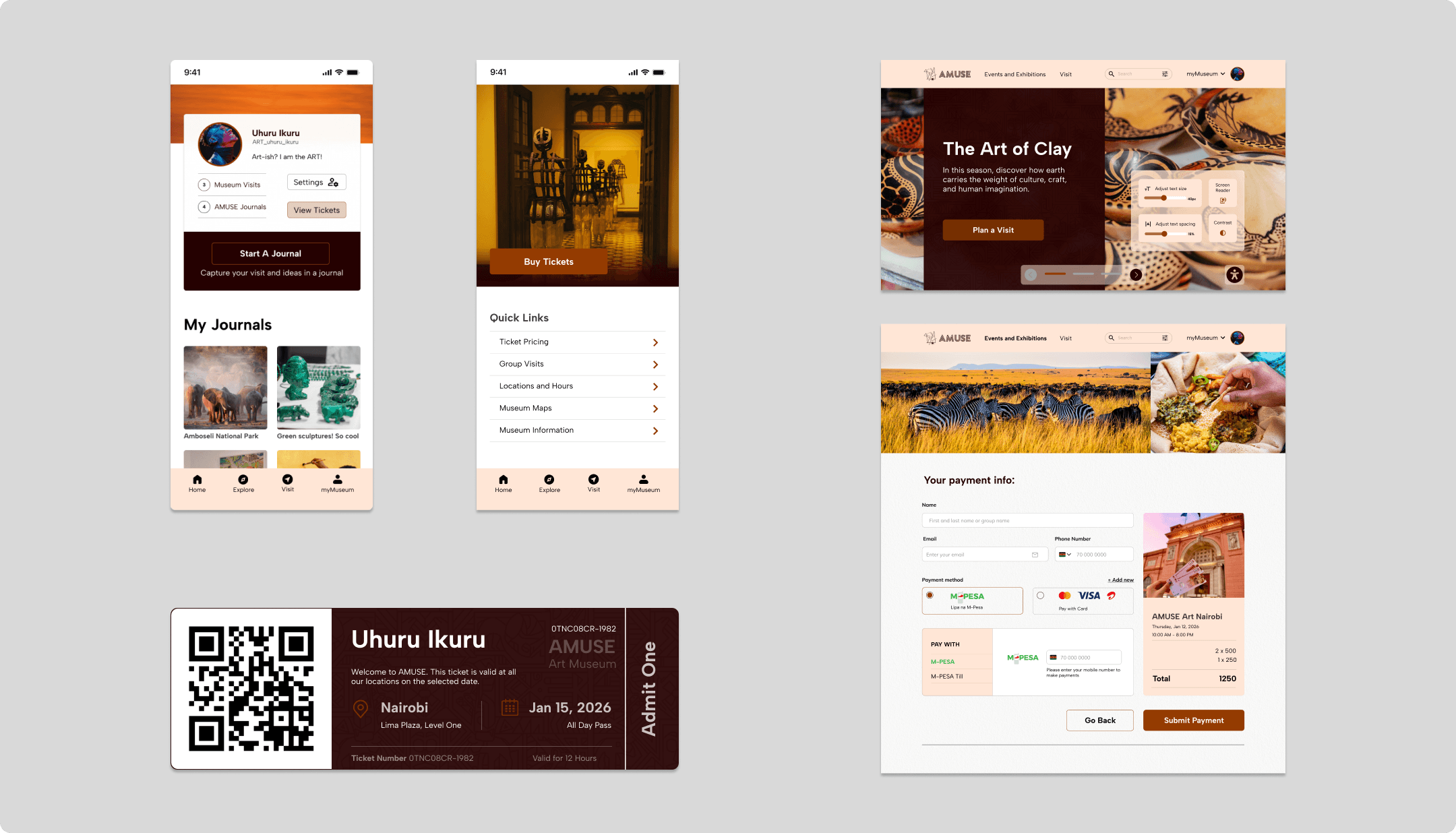
I designed a modern museum platform, available as both a mobile app and responsive web experience, to close this gap. It reimagines how Kenyans discover museums, explore exhibitions, and schedule visits, creating a seamless, intuitive journey from discovery to booking tickets.
Most museum websites feel outdated, and contemporary art museums in Kenya are almost invisible online.
There is little emphasis on mobile first design, and no integration with mobile money, despite how central it is to everyday transactions.
I designed a modern museum platform, available as both a mobile app and responsive web experience, to close this gap.
It reimagines how Kenyans discover museums, explore exhibitions, and schedule visits, creating a seamless, intuitive journey from discovery to booking tickets.
10+
Distinct user journey maps
90%
Targeting 90% of Kenyan adults who use mobile money through M-Pesa
<02
Minutes to book, hours saved from queuing.
10+
Distinct user journey maps
90%
Kenyans adults who can now buy AMUSE tickets online
<02
Minutes to book, hours saved from queuing.
Roles & Responsibilities
Roles & Responsibilities
Role
Role
UX Designer
UX Researcher
UX Writer
UX Designer
UX Researcher
UX Writer
Tasks
Tasks
User research
Building empathy maps
User stories and user personas
Wireframing and prototyping
Usability testing
User research
Building empathy maps
User stories and user personas
Wireframing and prototyping
Usability testing
Tools
Tools
Figma
Figma
Context
Context
Imagine a museum that exists, but nobody can find it.
Imagine a museum that exists, but nobody can find it.
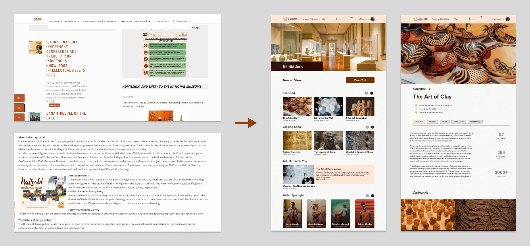
Kenyan museums are rich with contemporary art. But online, they are nearly invisible. Most websites are outdated, desktop only, and scattered across multiple platforms. Online discovery and booking is such a painful user experience that Kenyans "prefer" queueing to book tickets.
Kenyan museums are rich with contemporary art. But online, they are nearly invisible. Most websites are outdated, desktop only, and scattered across multiple platforms.
Online discovery and booking is such a painful user experience that Kenyans "prefer" queueing to book tickets.
Problem
Problem
Discovery and Booking Disconnection
Discovery and Booking Disconnection
Museums don't offer mobile money (M-Pesa) booking, even though over 90% of Kenyans use it. Users find exhibitions on TikTok or Instagram, then hit a wall when trying to get details or buy tickets online.
A visitor wants to plan a trip to see The Art of Clay. But the website has no pricing, no time slots, no reviews. So they either show up and hope for the better pricing, call the museum, or they don't go at all.
Kenyans want to engage with contemporary art. But they cannot effectively plan a visit from the comfort of their homes
Museums don't offer mobile money (M-Pesa) booking, even though over 90% of Kenyans use it. Users find exhibitions on TikTok or Instagram, then hit a wall when trying to get details or buy tickets online.
A visitor wants to plan a trip to see The Art of Clay. But the website has no pricing, no time slots, no reviews. So they either show up and hope for the better pricing, call the museum, or they don't go at all.
Kenyans want to engage with contemporary art. But they cannot effectively plan a visit from the comfort of their homes
Research
User Research
User Research
My user research sought to answer 3 questions:
Why do Kenyans struggle to book museum visits online?
How do users discover exhibitions?
Where does the journey break down?
Due to time constraints, I primarily used qualitative surveys and interviews. These findings informed the problem definition and guided early design decisions.
My user research sought to answer 3 questions:
Why do Kenyans struggle to book museum visits online?
How do users discover exhibitions?
Where does the journey break down?
Due to time constraints, I primarily used qualitative surveys and interviews. These findings informed the problem definition and guided early design decisions.
User Research Findings
User Research Findings
Every user pointed to the same four pain points
No pricing information available online
Limited mobile money integration despite 90% M-Pesa adoption among adults
Unresponsive sites on mobile
A gap between discovering something on TikTok and actually booking it.
Every user pointed to the same four pain points
No pricing information available online
Limited mobile money integration despite 90% M-Pesa adoption among adults
Unresponsive sites on mobile
A gap between discovering something on TikTok and actually booking it.
Competitive Case Studies
Competitive Case Studies
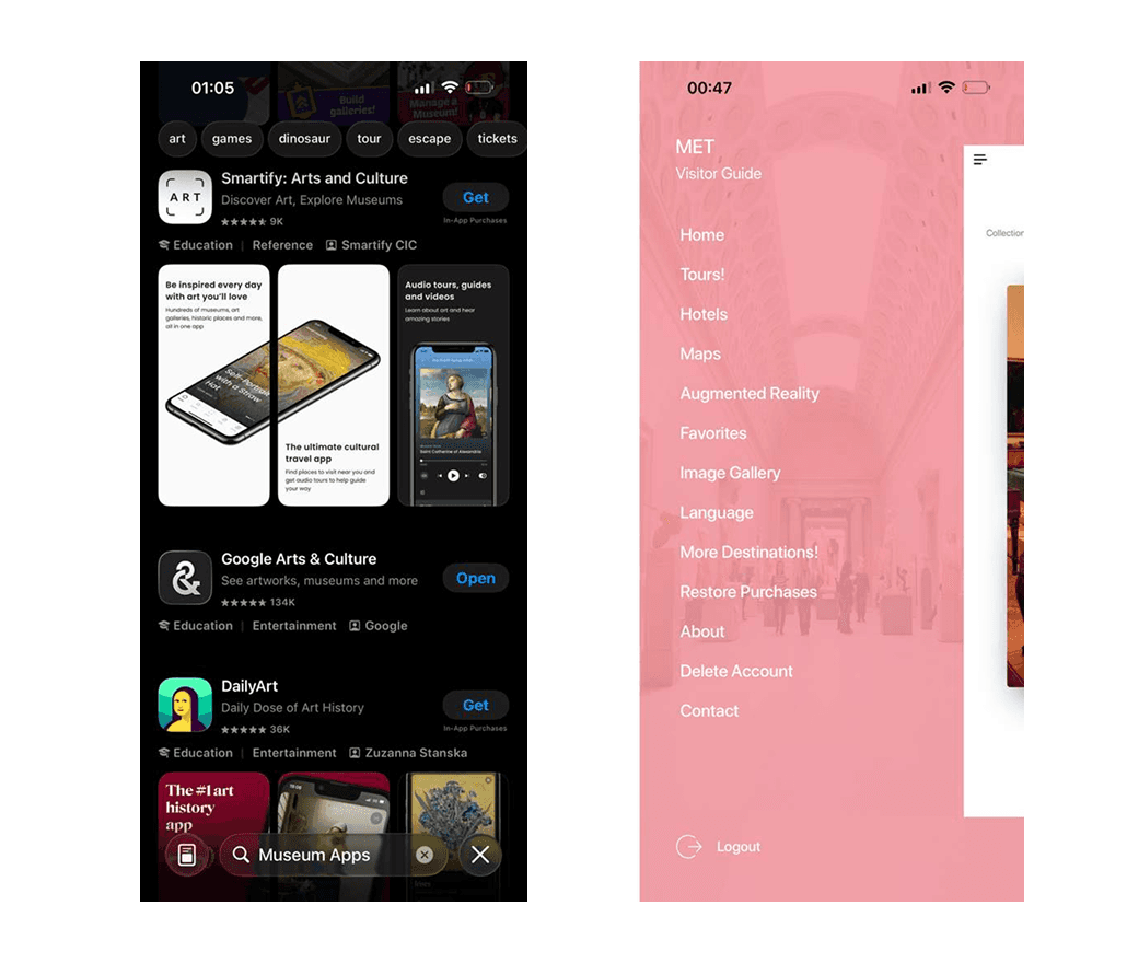
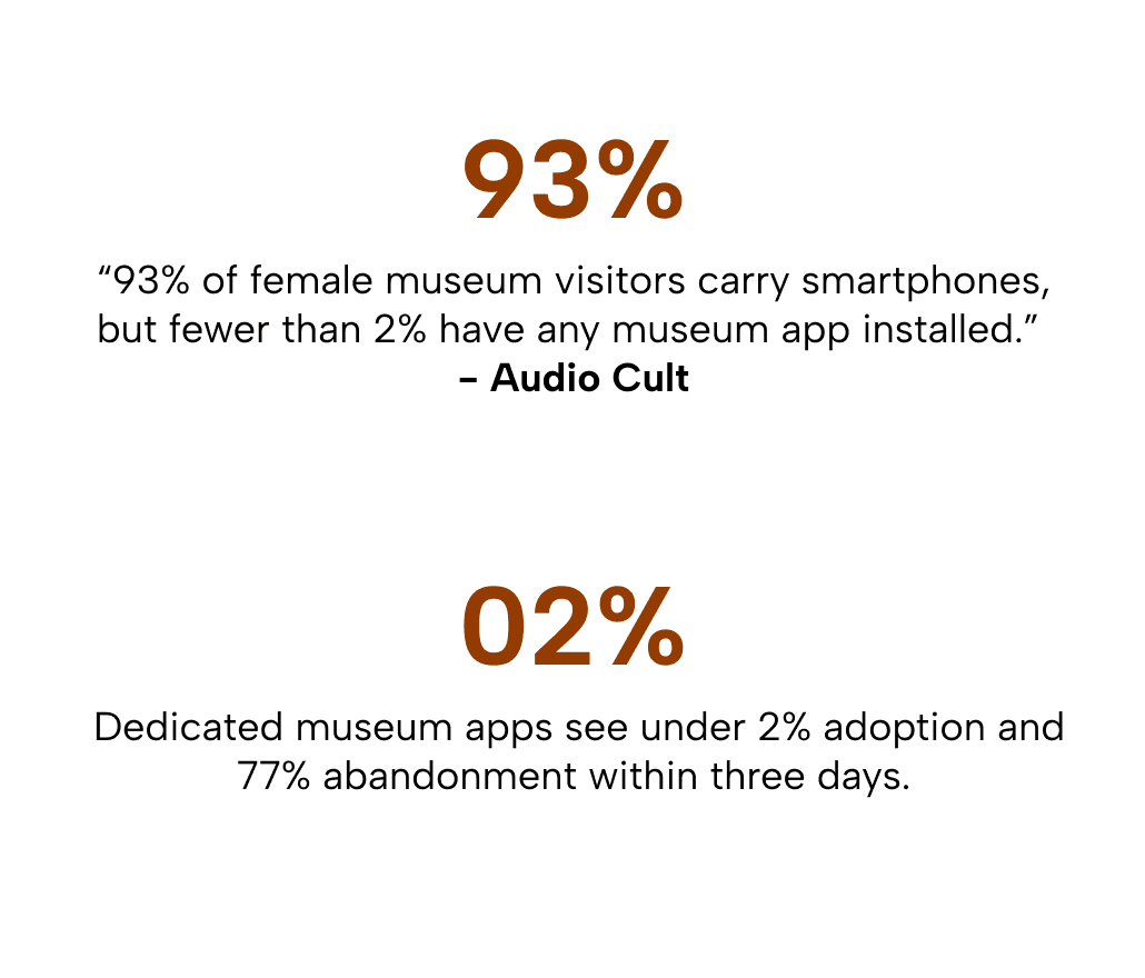
The competitive research strongly informed my design decisions. Dedicated museum apps see under 2% adoption and 77% abandonment within three days. The market had shifted toward multi institution platforms, and that changed what I was designing.
The competitive research strongly informed my design decisions. Dedicated museum apps see under 2% adoption and 77% abandonment within three days. The market had shifted toward multi institution platforms, and that changed what I was designing.
Persona
User Persona
User Persona
Problem Statement
Problem Statement
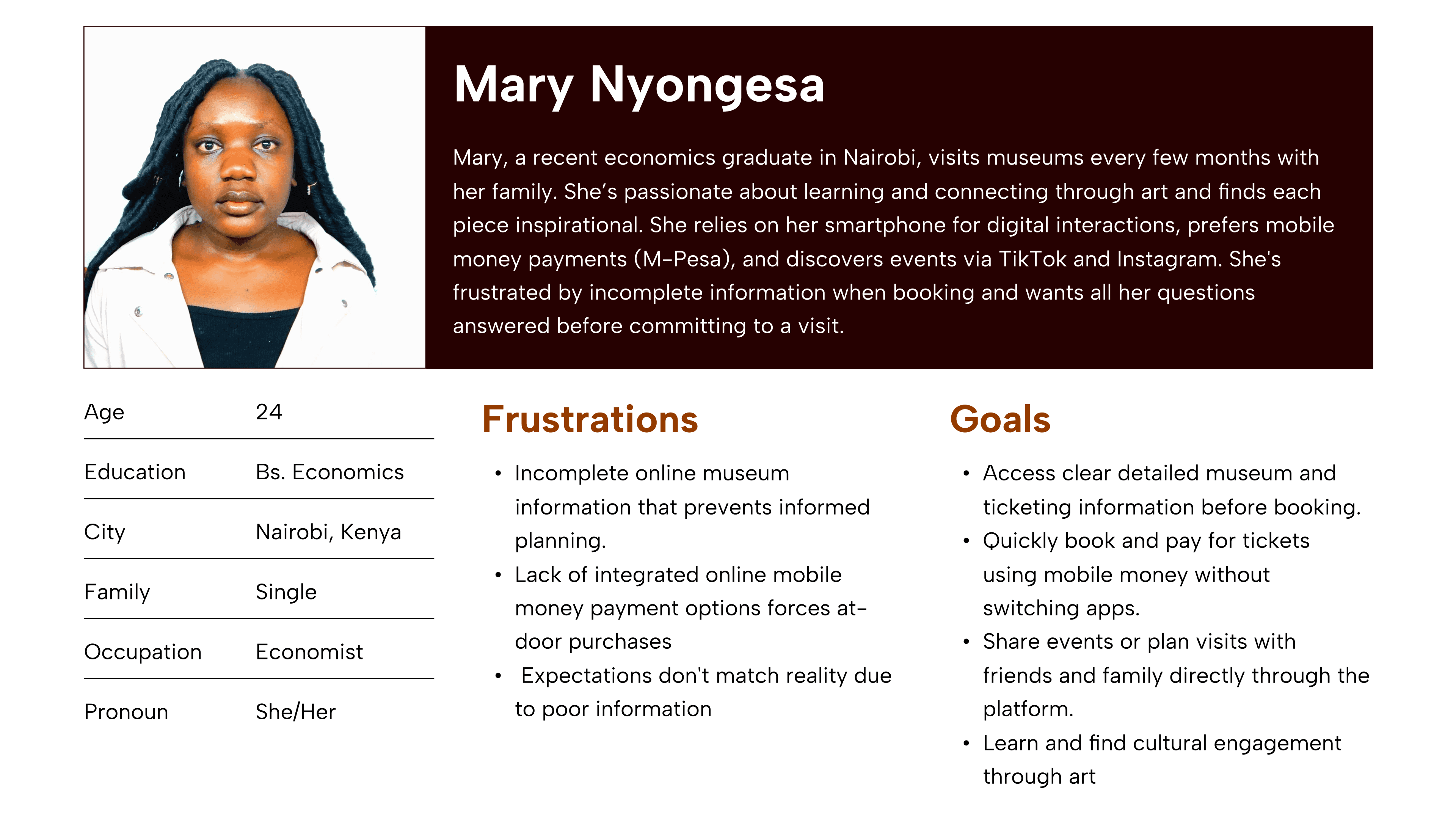
Mary, a young professional in Nairobi, needs an integrated mobile first museum booking solution because limited exhibition details and no digital payments make planning visits difficult.
Mary, a young professional in Nairobi, needs an integrated mobile first museum booking solution because limited exhibition details and no digital payments make planning visits difficult.
"It makes me feel inspired. I tend to remember how each piece of art is meant to carry a beautiful message."
"It makes me feel inspired. I tend to remember how each piece of art is meant to carry a beautiful message."
User Journey Maps
User Journey Maps
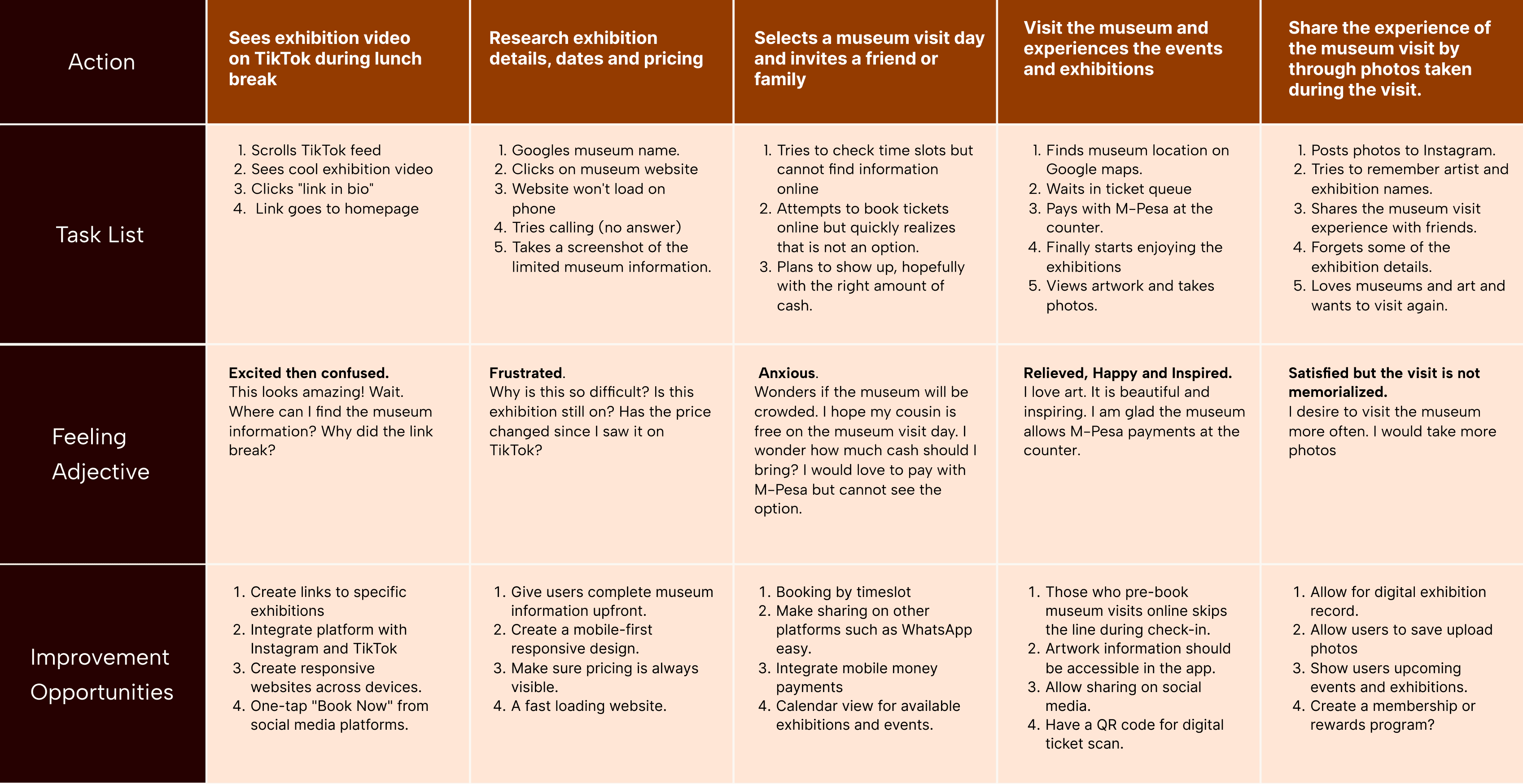
The user journey maps trace how Mary discovers, plans, and books a museum visit, capturing where she feels excited, where she hits friction, and where the experience breaks down entirely.
Click here to view expanded persona and journey maps.
The user journey maps trace how Mary discovers, plans, and books a museum visit, capturing where she feels excited, where she hits friction, and where the experience breaks down entirely.
Click here to view expanded persona and journey maps.
Design
Site Maps
Site Maps
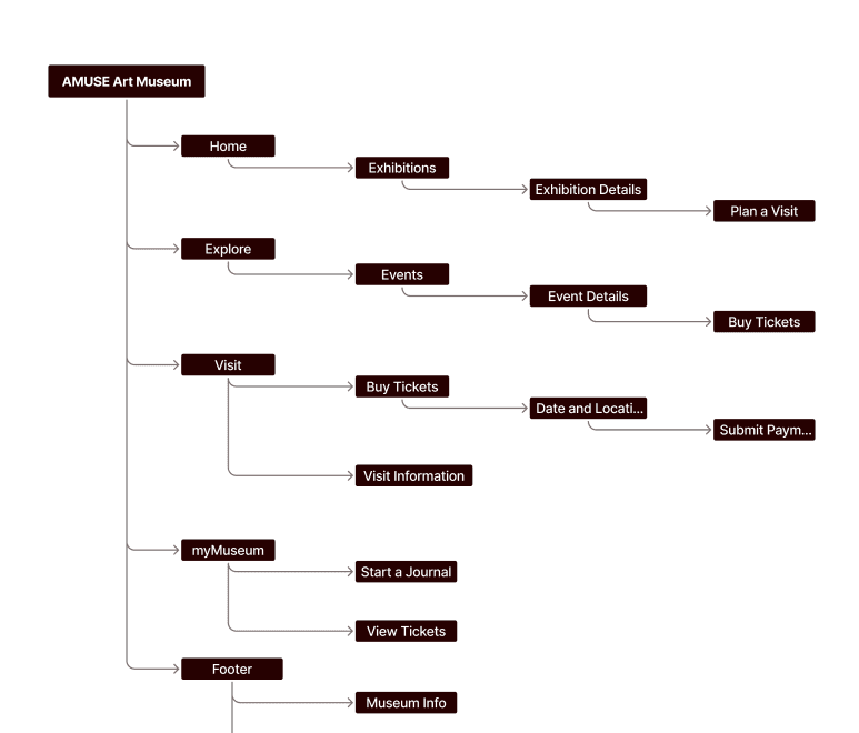
I designed user centered flows to enable my personas achieve their key goals while minimizing existing pain points. Click here to view expanded mode.
I designed user centered flows to enable my personas achieve their key goals while minimizing existing pain points. Click here to view expanded mode.
Wireframing
Wireframing
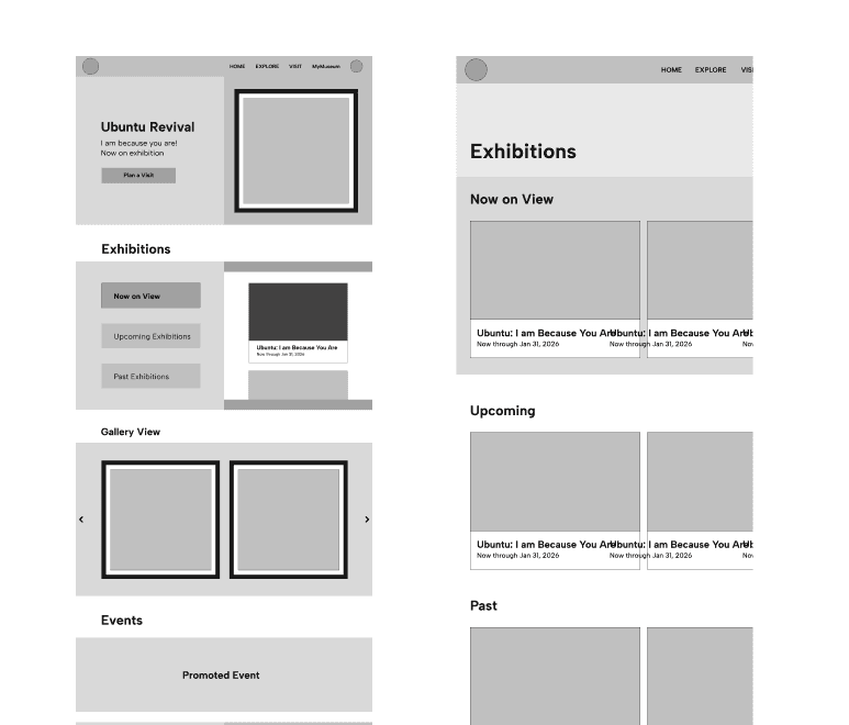
I started my design by sketching the screens on paper. This helped capture ALL ideas fast, before selecting the best ideas.
As I transferred the sketches into Figma, my initial concept was a digital wall of art. I combined skeuomorphism and split-screen design to evoke a museum like atmosphere while allowing users to complete multiple tasks without switching screens.
However, I quickly found that skeuomorphism requires a lot of space, had major accessibility issues, and aged quickly, making it less future ready. Split-screen design increased cognitive load by forcing users to balance attention between two panels.
I started my design by sketching the screens on paper. This helped capture ALL ideas fast, before selecting the best ideas.
As I transferred the sketches into Figma, my initial concept was a digital wall of art. I combined skeuomorphism and split-screen design to evoke a museum like atmosphere while allowing users to complete multiple tasks without switching screens.
However, I quickly found that skeuomorphism requires a lot of space, had major accessibility issues, and aged quickly, making it less future ready. Split-screen design increased cognitive load by forcing users to balance attention between two panels.
Design Strategy
Design Strategy
Designing for the real world, not the ideal one
Designing for the real world, not the ideal one
Revisiting the problem surfaced two things that changed how I approached the solution.
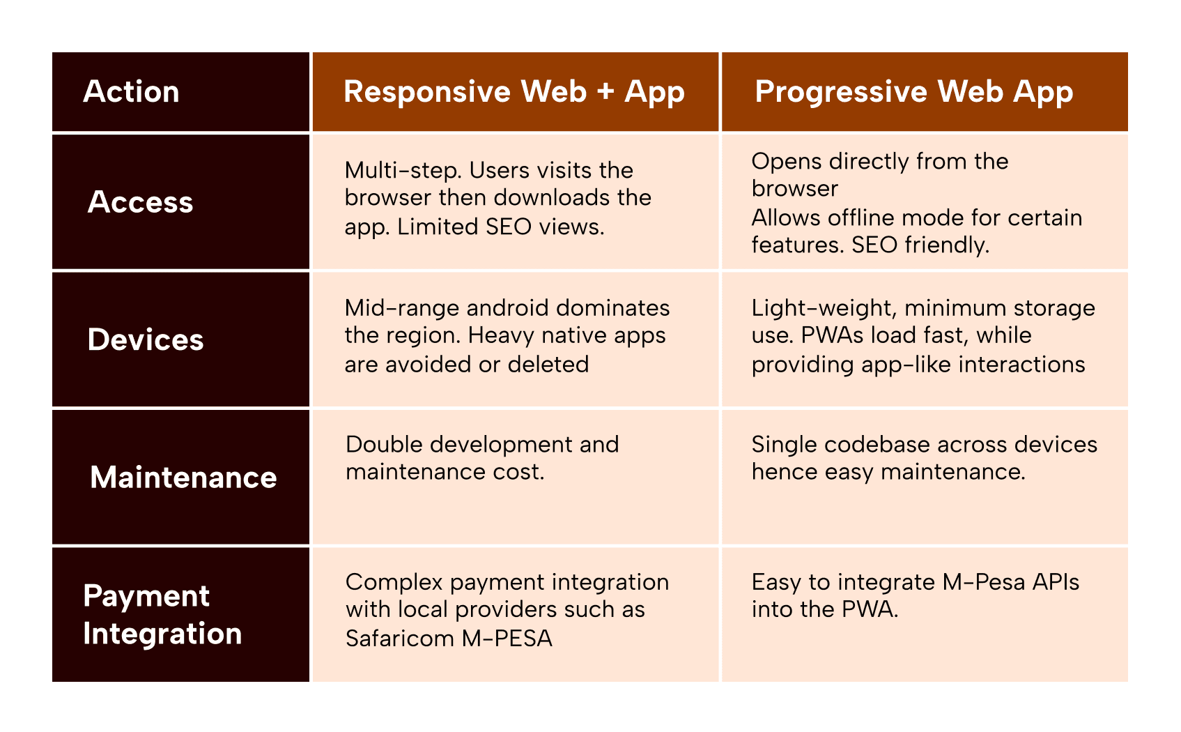
Dedicated museum apps see under 2% adoption and 77% abandonment within three days. Building another native app would solve nothing.
Kenya is mobile first, with inconsistent internet and mid range Android as the default device.
A PWA is the right fit. Fast, lightweight, no download required, and scalable across locations.
Revisiting the problem surfaced two things that changed how I approached the solution.
Dedicated museum apps see under 2% adoption and 77% abandonment within three days. Building another native app would solve nothing.
Kenya is mobile first, with inconsistent internet and mid range Android as the default device.
A PWA is the right fit. Fast, lightweight, no download required, and scalable across locations.
Lo-Fi Mockups and Prototypes
Lo-Fi Mockups and Prototypes
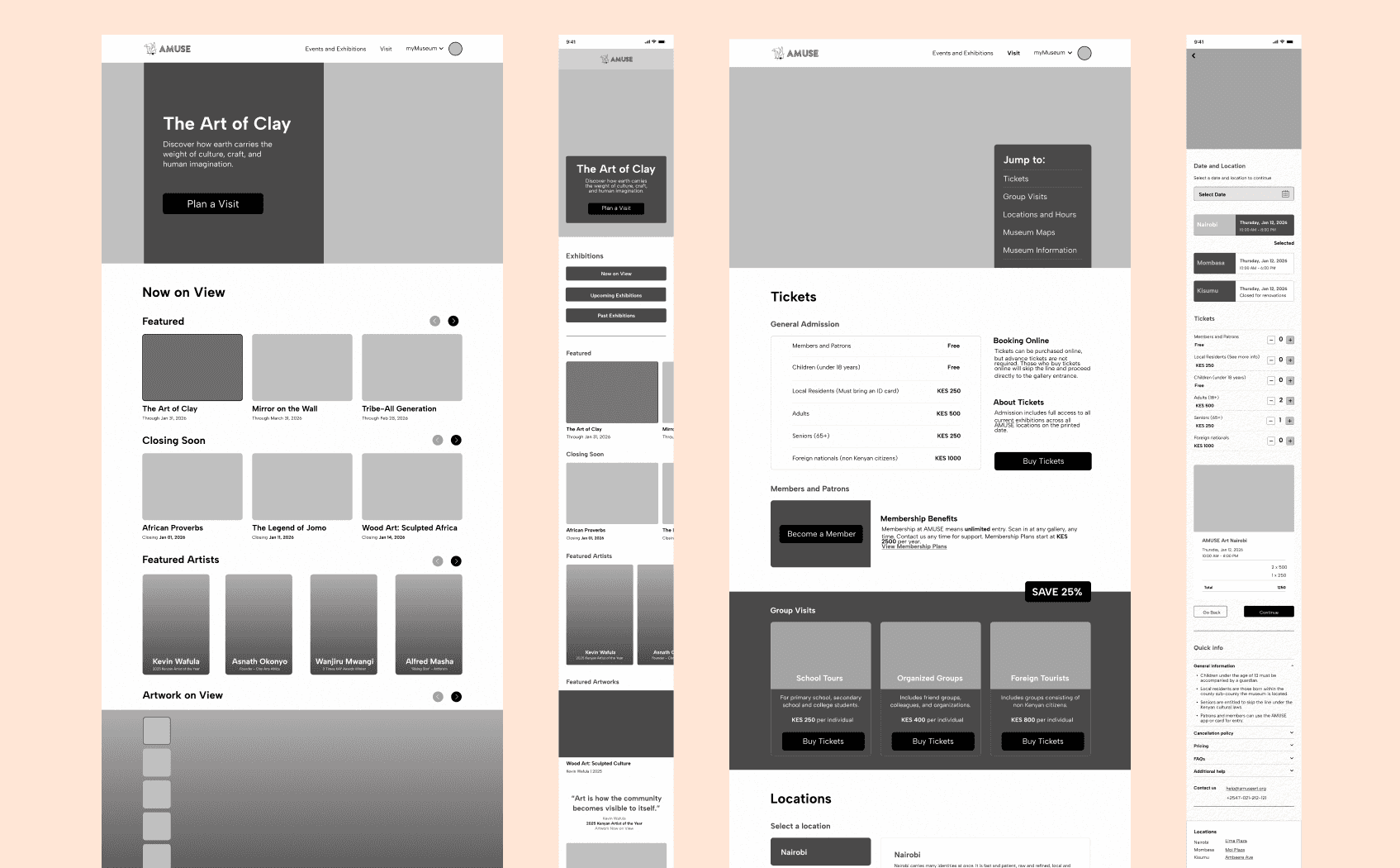
I used Figma to turn my ideas into mockups and protypes.
I used Figma to turn my ideas into mockups and protypes.
Usability
Usability Testing
Usability Testing
Study Type
Study Type
Unmoderated usability study
Unmoderated usability study
Participants
Participants
5 participants
3 from Kenya
2 from the United States
5 participants
3 from Kenya
2 from the United States
Location & Time
Location & Time
Nairobi, Kenya
Miami, Florida
15-20 mins
Nairobi, Kenya
Miami, Florida
15-20 mins
Usability Findings
Usability Findings
Search Bar
Search Bar
Most users reached for a search bar first. The design needed one, global, with quick filters, built for fast discovery.
Most users reached for a search bar first. The design needed one, global, with quick filters, built for fast discovery.
Events Page on Mobile
Events Page on Mobile
Most users never reached the events page. The link sat too far below the fold. A persistent navigation bar is needed for direct access to key pages.
Most users never reached the events page. The link sat too far below the fold. A persistent navigation bar is needed for direct access to key pages.
myMuseum feature
myMuseum feature
Every user explored it unprompted, spent at least two minutes there, and tried to start a journal. "Cool." "Amazing." The feature is validated. The next step is completing the full journaling experience.
Every user explored it unprompted, spent at least two minutes there, and tried to start a journal. "Cool." "Amazing." The feature is validated. The next step is completing the full journaling experience.
Design System
Design System
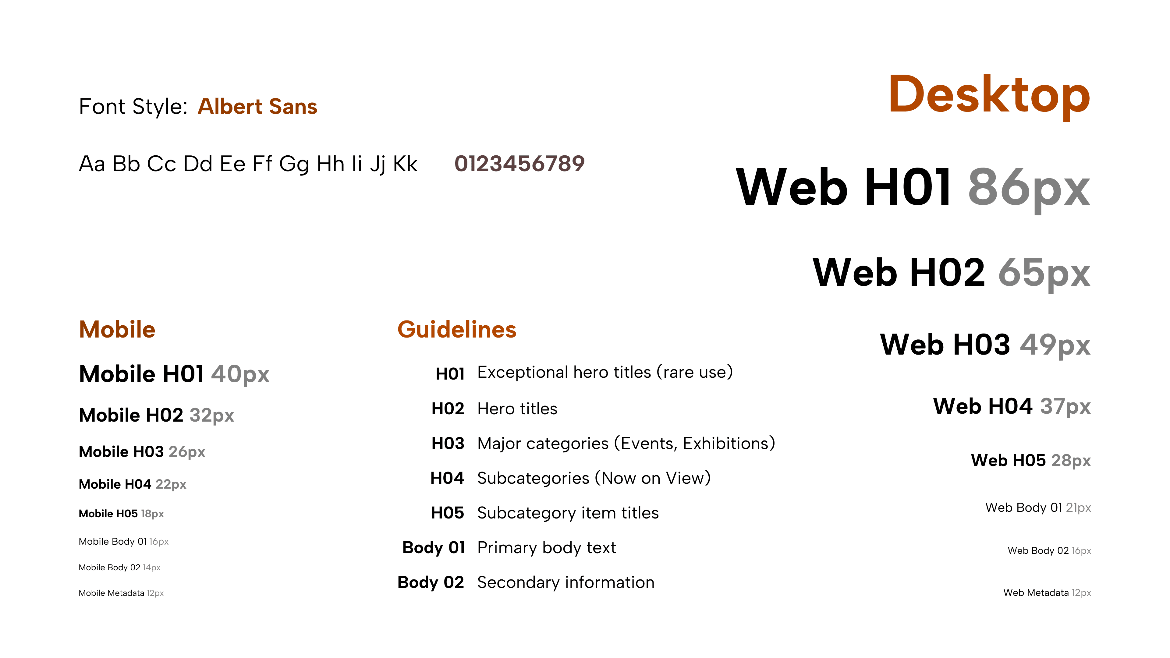
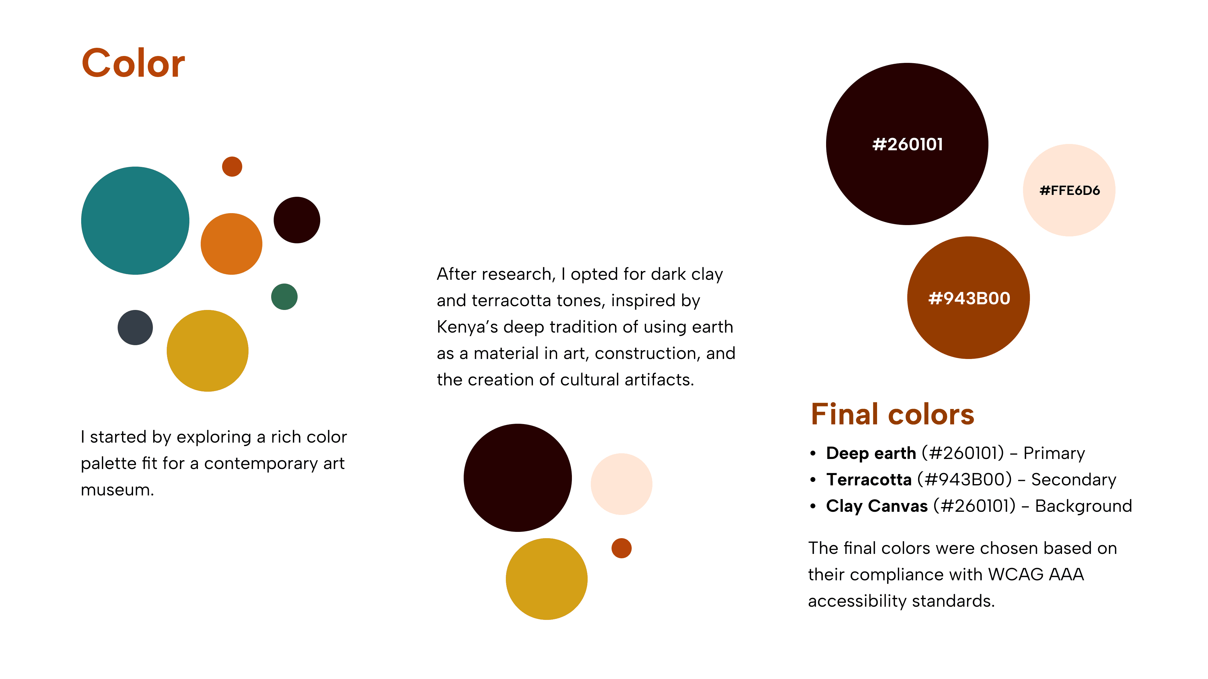
The Design System is rooted in African colors, and heritage
The Design System is rooted in African colors, and heritage
Hi - Fi Mockups & Prototypes
Hi - Fi Mockups & Prototypes
Refining the Design
Refining the Design
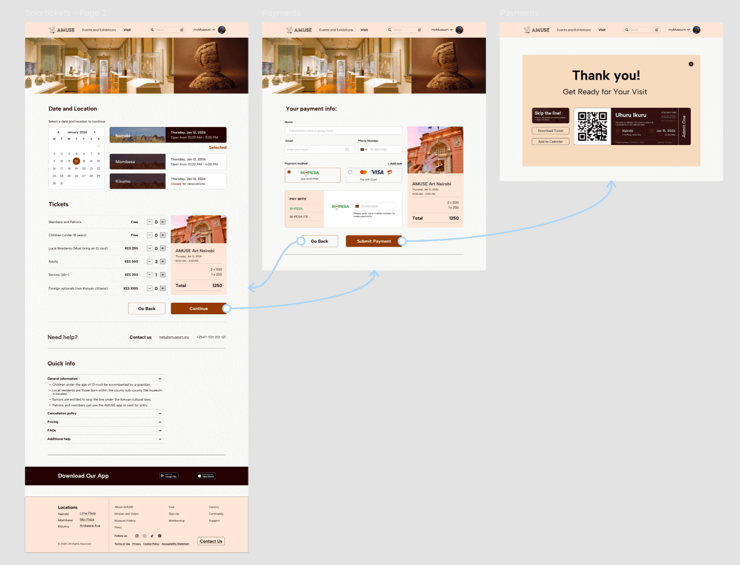
I made search a global feature and completed the journaling experience. The community’s response to myMuseum pushed me to go further, leading to “Art, But With You,” a participatory feature where museum visitors use strings to co-create a predefined art piece.
I made search a global feature and completed the journaling experience.
The community’s response to myMuseum pushed me to go further, leading to “Art, But With You,” a participatory feature where museum visitors use strings to co-create a predefined art piece.
Accessibility
Digital
Digital
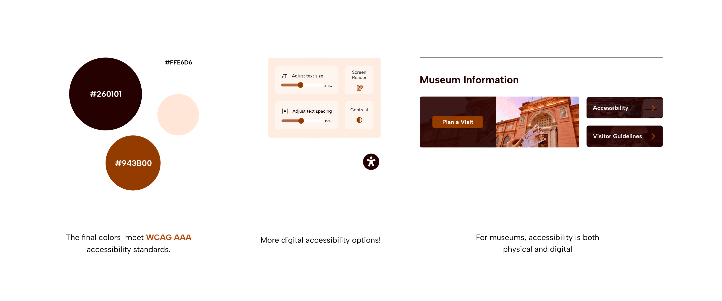
I chose the final colors based on WCAG AAA compliance. Other accessibility features include adjustable text size, spacing, contrast toggle, and screen reader support and are all accessible through a persistent accessibility icon.
I chose the final colors based on WCAG AAA compliance. Other accessibility features include adjustable text size, spacing, contrast toggle, and screen reader support and are all accessible through a persistent accessibility icon.
Physical
Physical
A dedicated Accessibility card in the Museum Information section communicates AMUSE's commitment to accessible facilities, programs, and services, so visitors with disabilities can plan their visit with confidence.
A dedicated Accessibility card in the Museum Information section communicates AMUSE's commitment to accessible facilities, programs, and services, so visitors with disabilities can plan their visit with confidence.
Key Takeaways
Impact
Impact
The goal from the start was to design for both the user and the client.
The goal from the start was to design for both the user and the client.
For users, the platform simplifies discovery and booking, surfaces complete information, supports M-Pesa payments, and works on any device. The myMuseum journal feature deepens engagement beyond the visit itself.
For the client, a PWA means one codebase, low maintenance, and a platform that scales across multiple locations.
For users, the platform simplifies discovery and booking, surfaces complete information, supports M-Pesa payments, and works on any device. The myMuseum journal feature deepens engagement beyond the visit itself.
For the client, a PWA means one codebase, low maintenance, and a platform that scales across multiple locations.
10+
Distinct user journey maps
Distinct user journey maps
90%
Targeting 90% of Kenyan adults who use mobile money through M-Pesa
Targeting 90% of Kenyan adults who use mobile money through M-Pesa
<02
<02
Minutes to book, hours saved from queuing.
Minutes to book, hours saved from queuing.
User Retention through myMuseum
User Retention through myMuseum
Lessons
Lessons
This design shaped both my thinking and design process.
Pivoting from the "digital wall of art" taught me to drop ideas that do not work in the real world, even though they look nice.
M-Pesa integration reminded me that user needs are contextual and localized, not universal.
The myMuseum response proved that new ideas are worth testing through usability studies
This design shaped both my thinking and design process.
Pivoting from the "digital wall of art" taught me to drop ideas that do not work in the real world, even though they look nice.
M-Pesa integration reminded me that user needs are contextual and localized, not universal.
The myMuseum response proved that new ideas are worth testing through usability studies
Next Steps
Next Steps
Design. Iterate. Feedback. Repeat
Connect with senior designers to critique the mobile first design for emerging markets
Build the myMuseum section of AMUSE as a full feature app.
Design. Iterate. Feedback. Repeat
Connect with senior designers to critique the mobile first design for emerging markets
Build the myMuseum section of AMUSE as a full feature app.